
CHECKOUT.COM
Helping checkout.com evolve from product to brand.

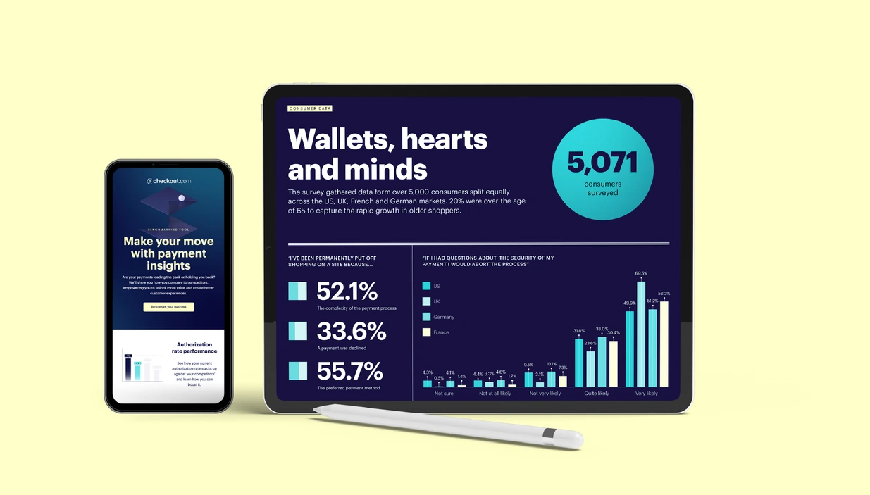
checkout.com is a global payment solution provider and one of the most valuable fintechs in the world. Internally, the vision for the products we were building and the philosophical approach to how we build those products was clear, but it wasn't always reflected to the outside world.
The rebrand required us to dig deep and ask ourselves: How do we want to be seen and what do we want to say? Why do we exist? ‘Cut through banking’s complexity and empower businesses to change the world’ and our purpose as ‘Building the banking business deserves’ were real breakthroughs.
From there, we created a comprehensive brand platform which articulates what Checkout.com stands for. We’ve brought this to life through a strong visual identity and tone of voice that are instantly recognisable and strategically sound, setting them apart from their competitors, and having the stretch to meet all future brand needs.


Movement and flow.
The concept of connectivity, movement and flow was the compelling and meaningful thread in the new brand. Everything flows when things are connected — data, insight, innovation, communication, value and growth. Seamless payment experiences are flowing. Checkout.com's technology is fluid, it can be easily shaped for the business's needs now and in the future, from connected payments to connected finance. So we've leveraged this concept through primary 3D visual assets, stylistic elements, typography and tone of voice.


